Let's build - Christmas lights with HTML, CSS and JavaScript
16 Dec, 2019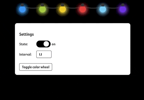
In this article, I'll be discussing how to build an interactive light display using the three musketeers of the frontend - HTML, CSS & JavaScript. We'll build a string of lights to simulate the effect of blinking lights similar to Christmas lights as seen during Christmas holidays.
To follow along with this, you should be fairly comfortable with using HTML, CSS and JavaScript.
You can find the final result for this on Codepen
Structure
Before proceeding with anything else, we'll have to first define the structure of
the light display using HTML. We'll create a file called index.html and define a couple
of divs to represent our light bulbs:
1 2 3 4 5 6 7 8 9 10 11 12 13 14 15 16 17 18 19<!DOCTYPE html> <html lang="en"> <head> <meta charset="UTF-8" /> <meta name="viewport" content="width=device-width, initial-scale=1.0" /> <meta http-equiv="X-UA-Compatible" content="ie=edge" /> <title>Christmas Lights</title> </head> <body> <section class="light-bulbs"> <div class="light-bulb theme-color-one"></div> <div class="light-bulb theme-color-two"></div> <div class="light-bulb theme-color-three"></div> <div class="light-bulb theme-color-four"></div> <div class="light-bulb theme-color-five"></div> <div class="light-bulb theme-color-one"></div> </section> </body> </html>
At this point we should have an empty page staring right back at us but with the markup that we have defined, we have laid the necessary groundwork for the light display we set out to build.
Note that it's not mandatory that divs are used for this, any block level
element will do.
Style
Now that we have the initial setup of the page structure, Let's move on to the styling.
What we want to do is style our divs to look light light bulbs connected via strings
and to give each of them unique colors that can also be changed as needed (we'll
implement this when we add behavior). If you take a look at the HTML, you'll
notice that each div has a class of light-bulb and an extra class to represent
the color for that particular div.
This is done this way so that we can apply
general styles that will affect all divs as well as specific styles for each
individual div. Let's create a file called style.css that will contain all
the necessary style declarations. We'll then proceed to link this file to the
html page we created earlier:
1 2 3 4 5 6 7 8 9 10 11 12 13 14 15 16 17 18 19 20 21 22 23 24 25 26 27 28 29 30 31 32 33 34 35 36 37 38 39 40 41 42 43 44 45 46 47 48 49 50:root { --theme-color-one: #025ba0; --theme-color-two: #9bc72b; --theme-color-three: #f0c517; --theme-color-four: #bf1724; --theme-color-five: #5cc9f4; --white: #fff; --black: #000; --grey: #999; background: var(--black); color: var(--white); } body { font-family: 'Alatsi', sans-serif; } .light-bulbs { display: flex; justify-content: space-between; padding: 20px; width: 500px; margin: 0 auto; } .light-bulb { border-radius: 50%; height: 30px; width: 30px; } .light-bulb.theme-color-one { background: var(--theme-color-one); } .light-bulb.theme-color-two { background: var(--theme-color-two); } .light-bulb.theme-color-three { background: var(--theme-color-three); } .light-bulb.theme-color-four { background: var(--theme-color-four); } .light-bulb.theme-color-five { background: var(--theme-color-five); }
1 2 3 4 5 6 7 8 9 10 11 12 13 14<!DOCTYPE html> <html> <head> . . . <link href="https://fonts.googleapis.com/css?family=Alatsi&display=swap" rel="stylesheet" /> <link rel="stylesheet" href="./style.css" /> </head> <body> . . . </body> </html>
We've declared variables to store the color values for the different light bulbs as well as some common color values in the root element (this will come into play later when we add behavior to the page).
We've also set the containing element for the light bulbs to be a 500px flex container
and positioned it to the center of the page and set it's children (the light bulbs) to have an equal
amount of spacing between them.
For the light bulbs themselves, we've set their dimensions as well as a background
color for each light bulb and we've also made them a circle using the border-radius
property.
We also linked to the google font Alatsi and set the default font-family for the
page to Alatsi. This can be changed to any other font if we so desire.
The page should now look like this:

Now that we have this, all we need is styling to help represent the base of the light bulb and the string that will run through and connect each light bulb.
Let's add the following to the css file:
1 2 3 4 5 6 7 8 9 10 11 12 13 14 15 16 17.light-bulb { /* prior styles go here */ position: relative; } .light-bulb::before { content: ''; position: absolute; border: 2px solid #222; width: 10px; height: 10px; background: #222; border-top-left-radius: 5px; border-top-right-radius: 5px; left: 25%; top: -12px; }
We have used the pseudo element before to generate a representation of the base
of the light bulb. We set the dimensions, it's background color, the position and
then create curved borders using the border-top-left-radius and border-top-right-radius properties.
This will make the previous circles look a little bit more like real light bulbs.
The page should now look like this:

The next point of action is to add the string that connects each light bulb. Let's add this to our css file:
1 2 3 4 5 6 7 8 9 10 11 12 13 14 15.light-bulb::after { content: ''; top: -20px; left: 60%; position: absolute; width: 90px; height: 28px; border-bottom: 4px solid #222; border-radius: 50%; z-index: -1; } .light-bulb:last-of-type::after { border: none; }
Here, we've used another pseudo element, this time around, we used after to simulate the string
connecting each element. Just like the style declaration prior, we've set it's dimensions,
positioning and border-radius. We've also set it's z-index property to negative one (-1) so
that it appears behind every other element on the page (particularly the element representing the base of the light bulb).
We've also removed the border from the last light bulb because it is the last item and doesn't need the string simulation to show.
The page should look like this after applying this change:

Now, let's proceed to make our light bulbs slowly look like they are flashing on and off
by adjusting the box-shadow property of the light bulbs.
Let's add the following to the css file just after the root element:
1 2 3 4 5 6 7 8 9 10 11 12 13 14 15 16 17 18 19 20 21 22 23 24 25 26 27 28 29 30 31 32 33 34 35 36 37 38 39 40 41 42 43 44 45 46 47 48 49 50 51 52 53 54 55 56 57 58 59 60 61 62 63 64 65 66 67 68 69 70 71 72 73 74 75 76 77 78 79 80 81 82 83 84 85 86 87 88 89@keyframes light-up-theme-color-one { 0% { box-shadow: 0 1px 10px 5px var(--theme-color-one); } 25% { box-shadow: 0 1px 15px 5px var(--theme-color-one); } 50% { box-shadow: 0 1px 20px 5px var(--theme-color-one); } 75% { box-shadow: 0 1px 25px 5px var(--theme-color-one); } 100% { box-shadow: none; } } @keyframes light-up-theme-color-two { 0% { box-shadow: 0 1px 10px 5px var(--theme-color-two); } 25% { box-shadow: 0 1px 15px 5px var(--theme-color-two); } 50% { box-shadow: 0 1px 20px 5px var(--theme-color-two); } 75% { box-shadow: 0 1px 25px 5px var(--theme-color-two); } 100% { box-shadow: none; } } @keyframes light-up-theme-color-three { 0% { box-shadow: 0 1px 10px 5px var(--theme-color-three); } 25% { box-shadow: 0 1px 15px 5px var(--theme-color-three); } 50% { box-shadow: 0 1px 20px 5px var(--theme-color-three); } 75% { box-shadow: 0 1px 25px 5px var(--theme-color-three); } 100% { box-shadow: none; } } @keyframes light-up-theme-color-four { 0% { box-shadow: 0 1px 10px 5px var(--theme-color-four); } 25% { box-shadow: 0 1px 15px 5px var(--theme-color-four); } 50% { box-shadow: 0 1px 20px 5px var(--theme-color-four); } 75% { box-shadow: 0 1px 25px 5px var(--theme-color-four); } 100% { box-shadow: none; } } @keyframes light-up-theme-color-five { 0% { box-shadow: 0 1px 10px 5px var(--theme-color-five); } 25% { box-shadow: 0 1px 15px 5px var(--theme-color-five); } 50% { box-shadow: 0 1px 20px 5px var(--theme-color-five); } 75% { box-shadow: 0 1px 25px 5px var(--theme-color-five); } 100% { box-shadow: none; } }
What we've done here is declare keyframe animations that will increase the
blur of the light bulb at different points of the animation to be run. This will give
the effect that the light bulb has turned on and is increasing in intensity. At a 100%,
we set the box-shadow to none to give the effect of the light turning off.
You will also notice a bit of duplication in the different keyframes with the only
difference being the color being used for the box-shadow. With a tool like sass,
we could clean this up with a loop and some interpolation magic but we are in css
land so we have no such options.
We've also named the keyframes similarly to the color names used for the light bulbs but they can be given different names and it wouldn't make much of a difference. The important thing is making sure the different theme colors have a keyframe specific to just them.
The keyframe declarations alone won't do much unless they are used and so for our next point of action, we'll be applying the keyframe animations to the various light bulb elements. Let's add the following to our css file:
1 2 3 4 5 6 7 8 9 10 11 12 13 14 15 16 17 18 19 20 21 22 23 24 25.light-bulb { /* prior styles go here */ animation-duration: 1.1s; animation-iteration-count: infinite; } .light-bulb.theme-color-one { animation-name: light-up-theme-color-one; } .light-bulb.theme-color-two { animation-name: light-up-theme-color-two; } .light-bulb.theme-color-three { animation-name: light-up-theme-color-three; } .light-bulb.theme-color-four { animation-name: light-up-theme-color-four; } .light-bulb.theme-color-five { animation-name: light-up-theme-color-five; }
Now that we have added this to the css file, we should have a real light show on our hands.
We are now using the keyframe animations we declared earlier and we've specified a different
animation name for each light bulb. We've set the animation-duration for every
element to be 1.1s and for the animation to loop infinitely.
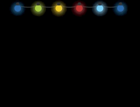
Our page should now look like this:
With that, we are all done with our styles for now. Now, let's add some behavior so that we can toggle the light display on or off, dynamically set the animation duration as well as change the color of the light bulbs when we want.
Behavior
Let's proceed to add some behavior to the light display. We want to be able to turn it on and off, change the animation duration and also we want to be able to set the color of each light bulb to a different color if we so choose.
Luckily for us, we can achieve all of this using JavaScript. First, we'll create
a file called christmas-light.js (it can be any name but the extension has to be js).
Once this has been done, we can now begin to add a little interactivity to the page.
We'll begin with implementing the ability to toggle the light bulbs. Let's modify our html a little bit to add a settings panel as well link our newly created js file.
Add the following to the html page:
1 2 3 4 5 6 7 8 9 10 11 12 13 14 15 16 17 18 19 20 21<!DOCTYPE html> <html> <head> ... </head> <body> <section class="light-bulbs">...</section> <section class="light-bulb-settings"> <h3>Settings</h3> <div class="group"> <label>State:</label> <div class="checkbox-container"> <input type="checkbox" class="light-switch" /> </div> <span class="light-switch-state">off</span> </div> </section> <script src="./christmas-light.js"></script> </body> </html>
With this, we should have a checkbox now displaying on the page but it will be a regular old checkbox and the entire settings panel will be flushed to the left side of the page. Let's give the settings panel some love by adding some style declarations for it to our css file:
1 2 3 4 5 6 7 8 9 10 11 12 13 14 15 16 17 18 19 20 21 22 23 24 25 26 27 28 29 30 31 32 33 34 35 36 37 38 39 40 41 42 43 44 45 46 47 48 49 50 51 52 53 54 55.light-bulb-settings { background: var(--white); color: #333; width: 500px; margin: 30px auto 0; padding: 20px; border-radius: 10px; } .light-bulb-settings .group { align-items: center; display: flex; margin: 15px 0; } .light-bulb-settings .group label { flex-basis: 80px; } .checkbox-container { cursor: pointer; width: 43px; height: 20px; background: var(--grey); border-radius: 100px; margin-right: 5px; position: relative; padding: 6px 12px; transition-duration: 0.4s; } .checkbox-container.active { background: var(--black); } .checkbox-container.active::after { left: 50%; } .checkbox-container::after { content: ''; position: absolute; width: 25px; height: 25px; background: var(--white); border-radius: 100%; left: 5%; top: 9%; transition-duration: 0.4s; } .light-switch { opacity: 0; visibility: hidden; }
With this, our settings panel will now appear right under the light bulbs and our regular old checkbox will be hidden (we'll add the checkbox behavior with JavaScript) and in it's place a toggle switch should appear:

Right now, if we click on the toggle, nothing happens and that is because we need to add the required behavior to our script file:
1 2 3 4 5const checkBoxContainer = document.querySelector('.checkbox-container'); checkBoxContainer.addEventListener('click', e => { e.target.classList.toggle('active'); });
With this in place, we should now be able to transition the toggle from it's initial state to a different state and back to it's initial state. We'll use these states to represent the light bulbs being on or off.
First, we'll have to modify our css file. Right now, the light bulbs are always in an active state but we want to change this behavior to allow the lights come on at the click of a switch. Initially, the light bulbs will be in a non-active state and when we click on the toggle, it'll switch the light bulbs on and then off if we click on it again.
To represent the state of the light bulbs being active, we'll introduce a new class
which we'll call on and this will be added to the light bulb container. The light
bulbs will only come on when this class is present, otherwise, the light bulbs will
remain inactive.
Let's modify the css file:
1 2 3 4 5 6 7 8 9 10 11 12 13 14 15 16 17 18 19 20 21 22 23 24.light-bulbs.on .light-bulb { animation-duration: 1.1s; animation-iteration-count: infinite; } .light-bulbs.on .light-bulb.theme-color-one { animation-name: light-up-theme-color-one; } .light-bulbs.on .light-bulb.theme-color-two { animation-name: light-up-theme-color-two; } .light-bulbs.on .light-bulb.theme-color-three { animation-name: light-up-theme-color-three; } .light-bulbs.on .light-bulb.theme-color-four { animation-name: light-up-theme-color-four; } .light-bulbs.on .light-bulb.theme-color-five { animation-name: light-up-theme-color-five; }
What we've done is we've added the light bulb container with an extra class of on
before the light bulb declarations. We've also moved the declaration for animation-duration
and animation-iteration-count out of .light-bulb and used a descendant combinator to instead
set those values for .light-bulb. What all of this means is that the animation will only
run when the container has a class of on.
With this out of the way, we can now add the required behavior to our script:
1 2 3 4 5 6 7 8 9 10 11 12const checkBoxContainer = document.querySelector('.checkbox-container'); const lightSwitch = document.querySelector('.light-switch'); const lightBulbContainer = document.querySelector('.light-bulbs'); checkBoxContainer.addEventListener('click', e => { e.target.classList.toggle('active'); lightSwitch.click(); }); lightSwitch.addEventListener('change', () => { lightBulbContainer.classList.toggle('on'); });
With this in place, we should now be able to toggle the state of the light bulbs:
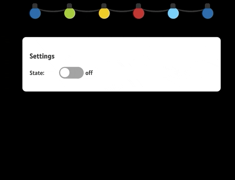
Awesome, the bulbs now light up when we click on the toggle switch but the text that represents the state of the toggle switch doesn't indicate when it's in an active state. Let's fix that by adding the following to the js file:
1 2 3 4 5const lightSwitchState = document.querySelector('.light-switch-state'); const lightSwitchLabels = { on: 'off', off: 'on' };
Here, we are just initializing variables that will come into play in a bit. We store a reference to the DOM element representing the light switch state and also an object that holds the two labels and the states that they will be transitioned to.
Now, let's add extra behavior to the event handler for the light switch (the checkbox element):
1 2// let's add this within the body of the function for the change event handler lightSwitchState.textContent = lightSwitchLabels[lightSwitchState.textContent];
With this in place, the label will now indicate when it's in an active state and when it's not:

We can now implement the next set of behaviors that we initially planned out to do. Next on our list is providing a way to dynamically change the animation duration. We'll use an input number field and add an event listener which will update the animation duration using the value of the input field.
First, let's add the following to our html file:
1 2 3 4 5 6 7 8 9 10 11 12 13 14 15 16 17 18 19 20 21 22 23 24 25 26 27<!DOCTYPE html> <html> <head> ... </head> <body> <section class="light-bulbs">...</section> <section class="light-bulb-settings"> <h3>Settings</h3> <div class="group">...</div> <div class="group"> <label>Interval:</label> <input class="interval-control" type="number" value="1.1" step="0.1" min="0.1" max="2" /> </div> </section> <script src="./christmas-light.js"></script> </body> </html>
We've set the default value for the input box to be indicative of what we set in
our style for the animation duration. We've also set the number to step in increments/decrements
of 0.1 and also set the minimum and maximum values allowed.
Note that a value can still be entered freely in the input box, the attributes only apply when the input controls are used.
Now, let's modify our script by adding the following:
1 2 3 4 5 6 7 8 9 10 11// this should be at the top with all the prior declarations const lightBulbs = lightBulbContainer.querySelectorAll('.light-bulb'); const intervalControl = document.querySelector('.interval-control'); // this should come after the event listener for the toggle switch intervalControl.addEventListener('change', e => { const duration = e.target.value; lightBulbs.forEach(lightBulb => { lightBulb.style.animationDuration = `${duration}s`; }); });
With this in place, we should now be able to modify the animation duration property of the light bulbs when we change the value of the number input field.
We should also style the number input field so that it is a little more consistent with the rest of the page:
1 2 3 4 5 6 7.interval-control { border: 1px solid var(--black); border-radius: 5px; font-family: inherit; font-size: inherit; padding: 6px 12px; }
Our page should now look like this:

When we interact with the interval control, the animation duration for the light bulbs will also change.
Let's proceed with implementing the final piece of behavior we set out to create -- the ability to change the colors of the light bulb.
To do this, we'll add a color picker beneath each light bulb. Changing the value of one particular color picker will affect the light bulb that maps to that picker.
Let's modify our html a bit:
1 2 3 4 5 6 7 8 9 10 11 12 13 14 15 16 17 18 19 20 21 22 23 24 25 26 27 28 29 30 31 32 33 34 35 36 37 38 39 40 41 42 43 44 45 46 47 48 49 50 51 52 53 54 55 56 57 58 59 60 61 62 63 64<!DOCTYPE html> <html lang="en"> <head> ... </head> <body> <section class="light-bulbs"> <div class="light-bulb theme-color-one"> <input type="color" class="color-setting" value="#025ba0" data-theme-color="one" /> </div> <div class="light-bulb theme-color-two"> <input type="color" class="color-setting" value="#9bc72b" data-theme-color="two" /> </div> <div class="light-bulb theme-color-three"> <input type="color" class="color-setting" value="#f0c517" data-theme-color="three" /> </div> <div class="light-bulb theme-color-four"> <input type="color" class="color-setting" value="#bf1724" data-theme-color="four" /> </div> <div class="light-bulb theme-color-five"> <input type="color" class="color-setting" value="#5cc9f4" data-theme-color="five" /> </div> <div class="light-bulb theme-color-one"> <input type="color" class="color-setting" value="#025ba0" data-theme-color="one" /> </div> </section> <section class="light-bulb-settings"> ... </section> <script src="./christmas-light.js"></script> </body> </html>
Within each light bulb element, we have added a color picker with a class of color-setting
for each so that we can add styling information for them later. We've also set the value
for each color picker to be the initial color of the light bulb they belong to and
finally, we've added a data attribute whose value points to the theme of the light bulb
it belongs to (this will come into play when we update our script).
Let's also add the following to our css file to get the color pickers to display right beneath the bulbs:
1 2 3 4 5 6 7.light-bulb .color-setting { margin-top: 15px; position: absolute; top: 100%; left: -25%; transition-duration: 0.4s; }
This will place each color picker right beneath the light bulb it belongs to. We've also set a transition duration because later on, we'll be hiding the color picker options and only revealing them when the user clicks on a button (which we'll be adding to the page soon) and we want the color pickers to slowly fade into view.
Now the page should look like this:

We are all set to implement the ability to change the color of the light bulbs as we please.
Let's add the following to the script:
1 2 3 4 5 6 7 8 9 10 11lightBulbContainer.addEventListener('input', e => { /* This uses destructuring to get the themeColor value set using the data attribute */ const { themeColor } = e.target.dataset; const lightBulb = e.target.parentElement; // This updates value of the css variable to the value set on the color picker lightBulb.style.setProperty(`--theme-color-${themeColor}`, e.target.value); });
We've used event delegation to attach an input event to the parent element of the color pickers and we dynamically update the css variable holding the value of the light bulbs color to whatever color is set on the color picker.
The only thing left now is to toggle the display of the color pickers on the click of a button.
Let's modify our html:
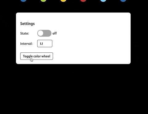
1 2 3 4 5 6 7 8 9 10 11 12 13 14 15 16 17 18 19 20 21 22 23 24 25 26 27 28 29 30 31 32 33 34 35 36 37 38 39 40 41 42 43 44 45 46 47 48 49 50 51 52 53 54 55 56 57 58 59 60 61 62 63 64 65 66 67 68 69 70 71 72 73 74 75 76 77 78 79 80 81 82 83 84 85 86<!DOCTYPE html> <html lang="en"> <head> ... </head> <body> <section class="light-bulbs"> <div class="light-bulb theme-color-one"> <input type="color" class="color-setting hidden" value="#025ba0" data-theme-color="one" /> </div> <div class="light-bulb theme-color-two"> <input type="color" class="color-setting hidden" value="#9bc72b" data-theme-color="two" /> </div> <div class="light-bulb theme-color-three"> <input type="color" class="color-setting hidden" value="#f0c517" data-theme-color="three" /> </div> <div class="light-bulb theme-color-four"> <input type="color" class="color-setting hidden" value="#bf1724" data-theme-color="four" /> </div> <div class="light-bulb theme-color-five"> <input type="color" class="color-setting hidden" value="#5cc9f4" data-theme-color="five" /> </div> <div class="light-bulb theme-color-one"> <input type="color" class="color-setting hidden" value="#025ba0" data-theme-color="one" /> </div> </section> <section class="light-bulb-settings"> <h3>Settings</h3> <div class="group"> <label>State:</label> <div class="checkbox-container"> <input type="checkbox" class="light-switch" data-elem="switch" /> </div> <span class="light-switch-state">off</span> </div> <div class="group"> <label>Interval:</label> <input class="interval-control" type="number" value="1.1" step="0.1" min="0.1" max="2" data-elem="interval" /> </div> <button class="color-wheel">Toggle color wheel</button> </section> <script src="./christmas-light.js"></script> </body> </html>
We've added a class of hidden to all of the color pickers on the page which means
they'll be hidden at first until we toggle their display. Within the
light bulb settings section, we've also added a new button which will be used
to toggle the display of the color pickers on click.
We should update the styling of the color picker toggle button to make it
more consistent with the rest of the page as well as add styling for the hidden
class:
1 2 3 4 5 6 7 8 9 10 11 12 13 14 15 16 17 18 19.hidden { opacity: 0; } .color-wheel { border: 1px solid var(--black); border-radius: 5px; cursor: pointer; font-family: inherit; font-size: 16px; margin-top: 10px; padding: 6px 12px; outline: 0; transition-duration: 0.4s; } .color-wheel:active { transform: scale(0.9); }
The page should now look like this:

Now that this is out of the way, we will proceed to implement the toggle behavior:
1 2 3 4 5 6 7 8 9 10// These initializations should be at the top with the other declarations const colorWheelBtn = document.querySelector('.color-wheel'); const colorWheels = lightBulbContainer.querySelectorAll('.color-setting'); // This can come right after the other event listener functions colorWheelBtn.addEventListener('click', e => { colorWheels.forEach(colorWheel => { colorWheel.classList.toggle('hidden'); }); });
With this in place, the color pickers will now toggle their display when the button is clicked.
Conclusion
Whew, we've reached the end of the article 👍🏾. I hope we've learnt something useful out of all this. If you read through the whole post then you deserve a reward, here, have a cookie (before the cookie monster gets them all)